How Colby Turned A Simple Plinko Concept Into A Branded Hero Animation
When Colby Realized The Original Video Was Not Enough
Colby reached out with a clear feeling, not a clear direction.
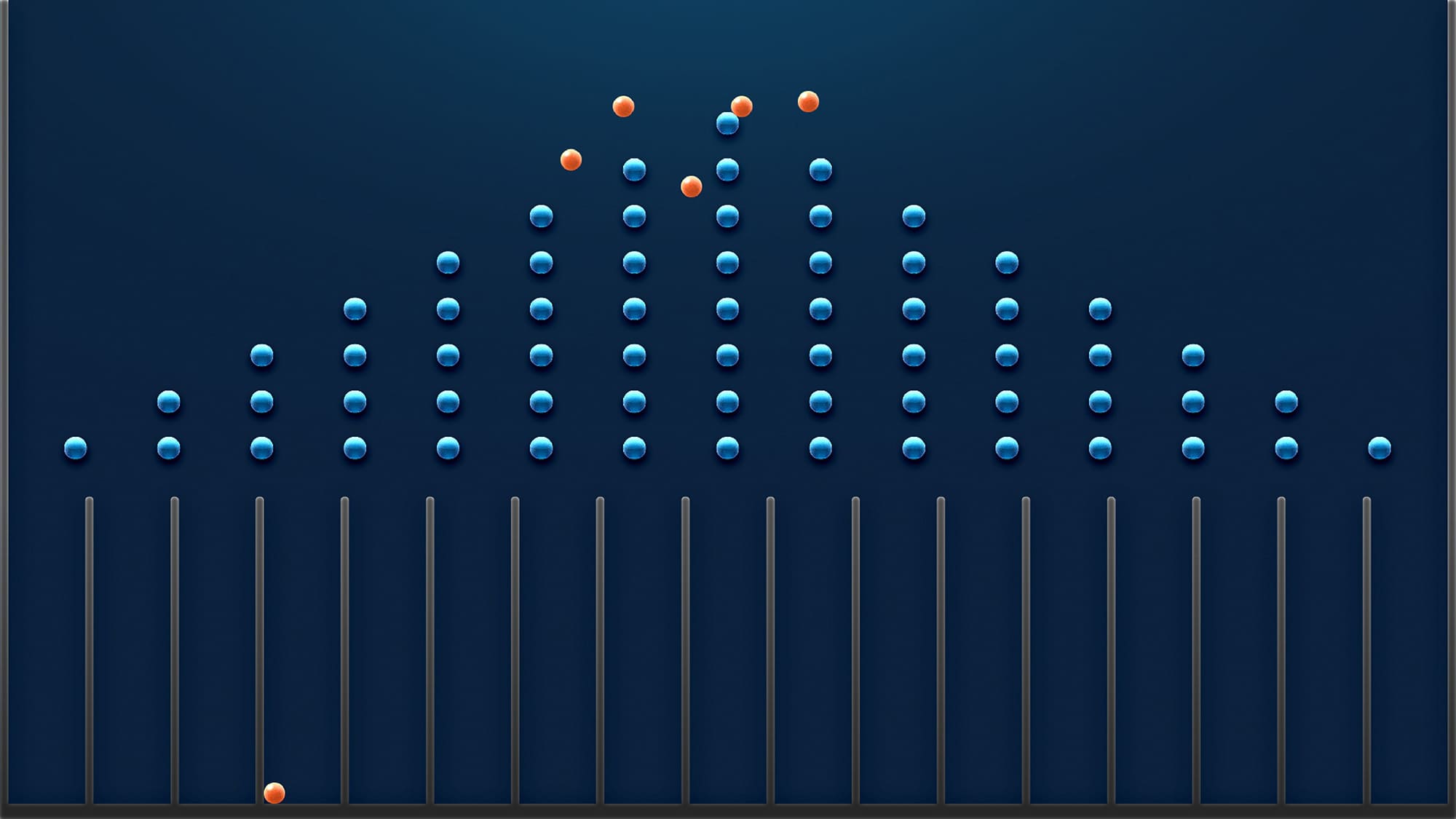
He had an animated video of balls dropping into columns.
Technically, it worked.
Visually, it did not feel like KetteQ.
His first message said it all:
No detailed reference. No visual guide. Just a rough description and a promise to share the brand site and guidelines.
I reassured him that I understood what he was trying to do and asked him to share his full vision for the new version.
The Brief That Was Clear On Paper, But Not In Spirit
Colby sent over a list of exactly what he wanted:
I took that list and turned it into a storyboard that followed his instructions. When I sent it over, his reaction was honest:
His Feedback:
“We like that the colors better match our brand guide, but overall, we think it looks too similar to the original video. Do you have any ideas on making this more visually appealing? We really like your other animations, so maybe something in the style of your other work would work.”
That is when it clicked.
The problem was not just the visuals.
It was the gap between what he wrote and what he actually wanted to see.
He did not want a cleaned-up copy.
He wanted something that felt more dynamic, more elevated.
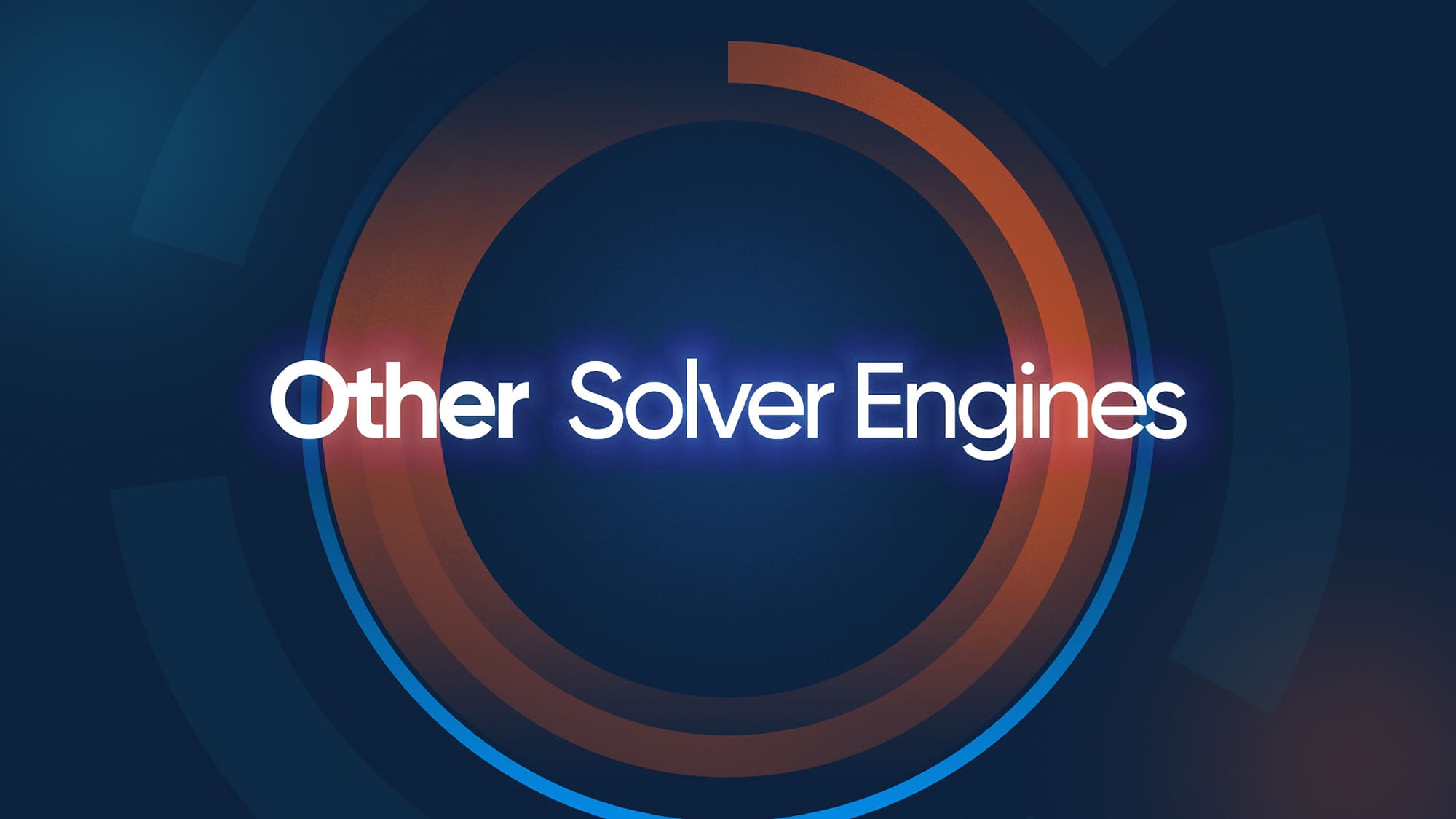
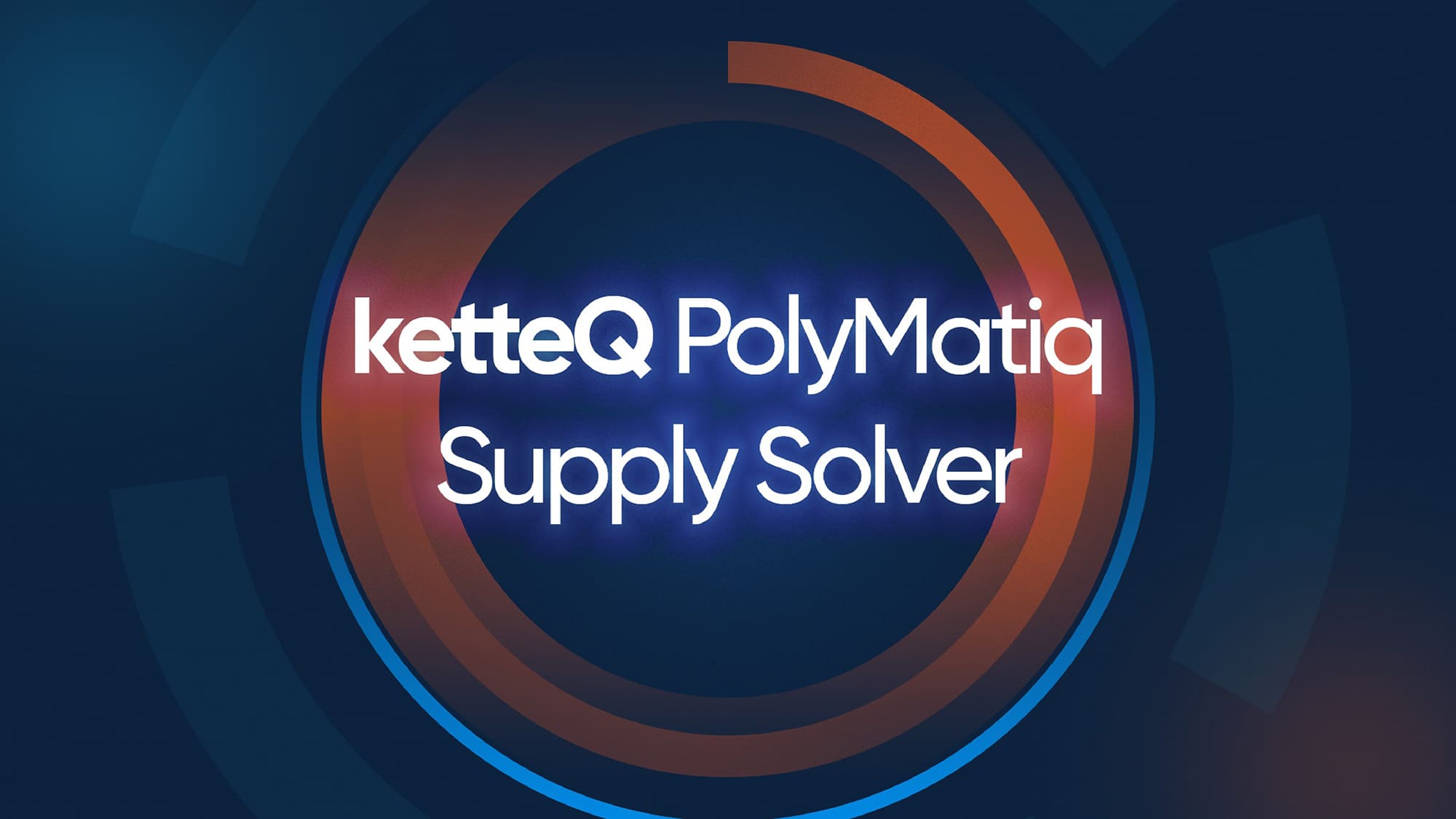
Our Mission: Align The Animation With The Vision In His Head
I shifted the conversation from “following the list” to “finding the right look”.
I suggested a new direction:
“We could experiment with background colors or subtle variations to bring in more 3D depth while keeping it aligned with your brand. What do you think?”
He loved it immediately.
His reply:
“Hi Shahida, I love where you are going with the title pages. Let’s definitely experiment with background colors or subtle variations to bring in more depth. I think going more 3D could elevate the look, and the hard black lines may be holding it back. Thank you again for being so helpful with this!”
From there, the project had a new north star.
Step 1
Resetting The Direction With Clarity And Scope
Once we agreed on adding depth and moving toward a more 3D feel, I confirmed the approach and the boundaries.
I replied:
“Yes, a touch of 3D would elevate the look. Yes, I would love to explore that direction.”
I also clarified the practical side: moving toward a more 3D style might slightly increase the budget, but I would keep it as cost-efficient as possible while still improving quality.
Colby was comfortable with that adjustment, and with that, the project officially shifted from a basic 2D revision to a more elevated visual piece.
Step 2
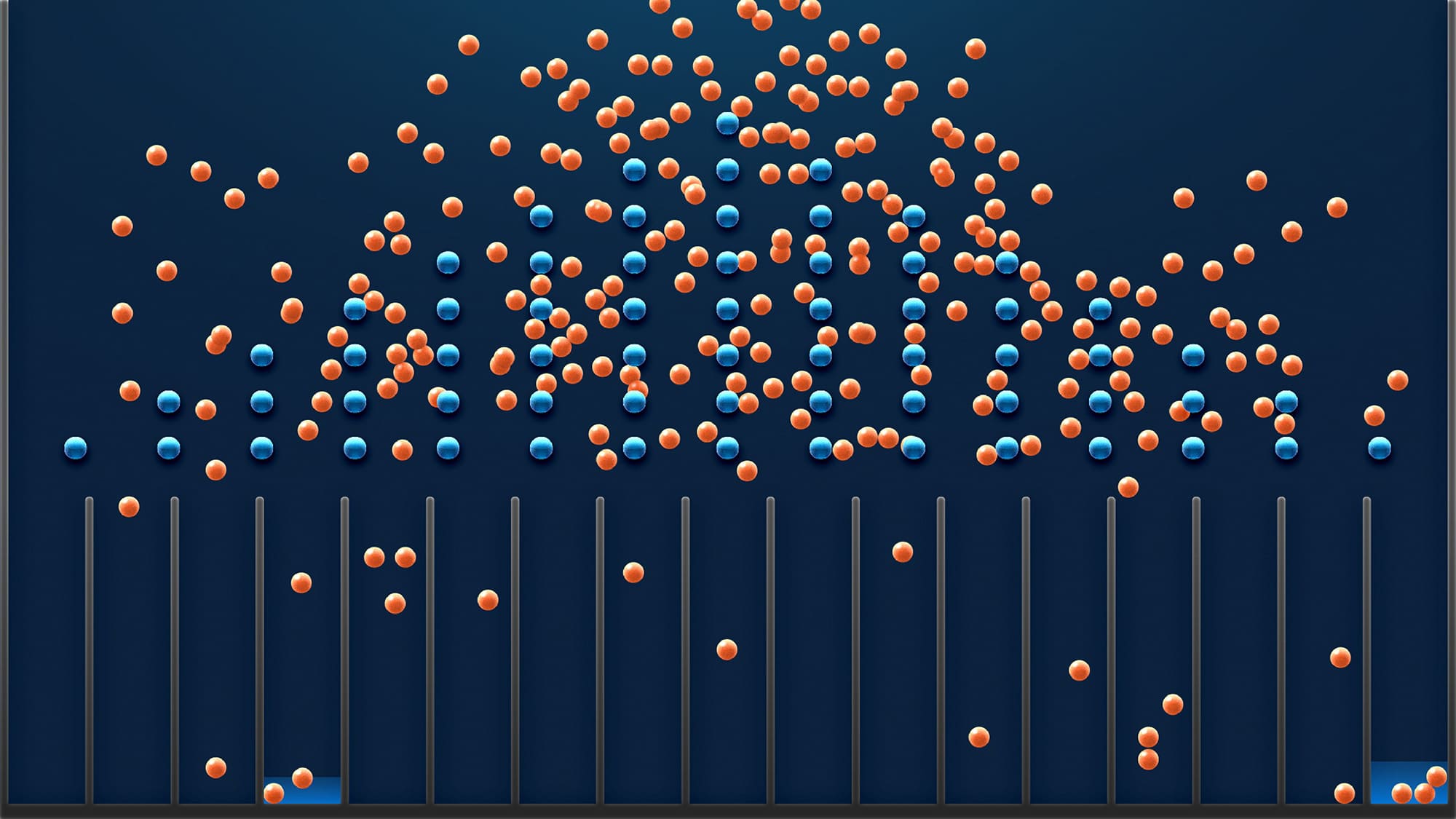
Evolving The Animation From Flat To Dimensional
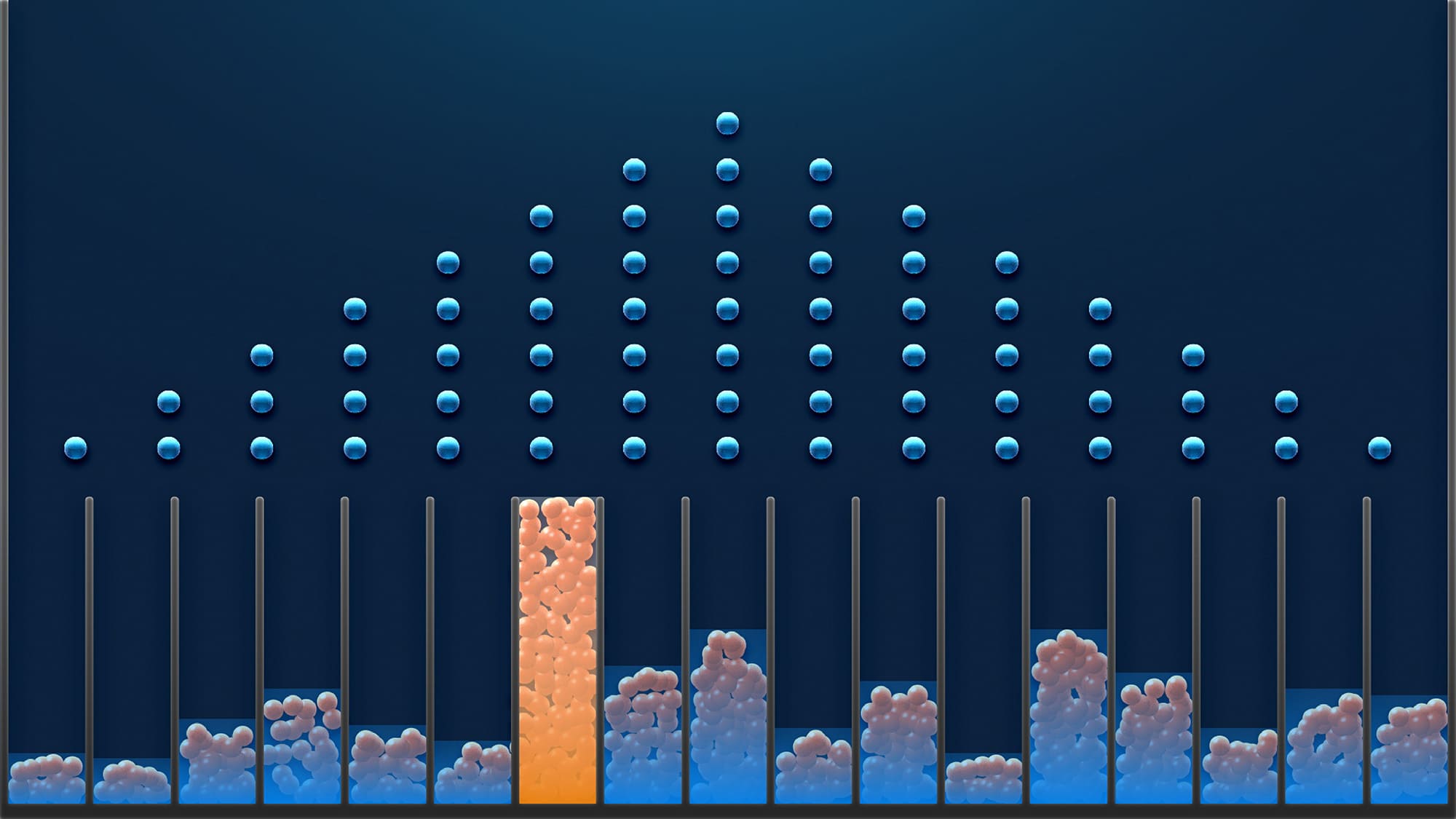
We took the original Plinko-style idea and rebuilt it with more depth:
The goal was simple:
It should feel like the same concept, but viewed through a much more modern, polished lens.
When I shared the updated version, his response said everything:
“This is looking great! The 3D element definitely elevates the look and feel.”
The alignment we had been working toward finally clicked.
Step 3
Delivering Both Depth And Flexibility
After the success of the 3D version, Colby came back with a new ask.
Now that the hero version was done, they realized they also needed a 2D version.
His message:
“Hi Shahida, yes, this is perfect! We are very happy with it. We actually identified a need for a 2D version in addition to this one. Would you be able to help us make a version like the first rendition you sent (see attached)?”
So we went full circle, but with clarity this time.
I created a refined 2D variant that:
In the end, they had both:
The Results
Both versions were delivered successfully.
Colby and his team were happy with the direction, the collaboration, and the final output.
His final message before closing the contract:
“I got all good feedback. Thank you again for working on these projects for us. It has been great working with you, and I hope to work with you again in the future. I will close the contract now and will definitely be leaving a 5-star review. Thank you again!”
And his public review summed it up:
“Shahida was a pleasure to work with. She is a very talented animator who can bring your written ideas to life.”
Why This Project Matters
This project was not just about balls dropping into columns.
It was about:
In the end, it proved that the real work is not just following a brief.
It is understanding the intention behind it and turning that into something the client is genuinely excited to put their name on.