
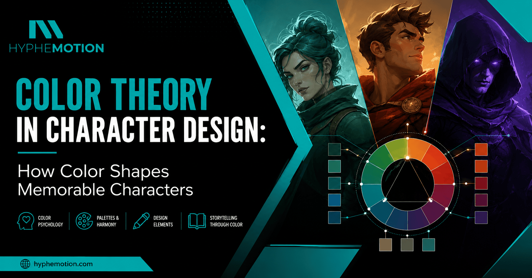
Spider-Man, Mario, Elsa, Batman, or any iconic character: before they speak or reveal their personalities, you instantly recognize them through their visual identity. While shape and silhouette play an important role, color theory in character design is what creates the strongest first impression.
Color is far more than a decorative element. It communicates personality, emotion, and narrative, helping audiences understand a character before a single line of dialogue is spoken. When used intentionally, color becomes a powerful storytelling device that makes characters memorable across animation, games, comics, and branding.
Research suggests that people form an initial impression within 90 seconds, and color influences that perception. Likewise, the report highlights that compelling visual storytelling continues to be one of the biggest drivers of audience engagement in digital media.
Whether you’re designing a game protagonist, an animated mascot, or a brand character, mastering color theory in character design helps create visuals that connect emotionally with audiences.
In this guide, you’ll learn how professional designers use color psychology, elements of design, and effective storytelling techniques to build characters people remember.
What Is Color Theory in Character Design?
Color theory in character design is the strategic use of color to communicate a character’s personality, emotions, and role within a story. Rather than choosing colors simply because they look appealing, designers use color intentionally to influence how audiences perceive a character from the very first glance.
Unlike general color theory, which focuses on color harmony and relationships, character design applies these principles to storytelling. Every choice—from hue and saturation to value and contrast—helps reinforce the character’s identity and emotional impact.
Combined with other elements of design, such as shape, texture, and composition, color creates a visual language that strengthens storytelling and improves character recognition.
How Color Drives Emotional and Visual Storytelling
Color has the power to shape emotions before a story even begins. Warm colors like red, orange, and yellow often convey confidence, energy, or passion, while cooler tones such as blue, green, and purple are commonly associated with calmness, intelligence, or mystery.
However, color meaning depends on context rather than hue alone. A bright red costume may symbolize courage for a superhero, while the same color can communicate danger or aggression when used for a villain. This is why successful designers combine color theory in character design with strong storytelling techniques to ensure every visual choice supports the narrative.
Understanding Color Psychology in Character Design
Color psychology helps designers influence how audiences perceive a character before they speak or act. While personality ultimately develops through writing and animation, color establishes immediate emotional expectations. This is why character designers, illustrators, and animation studios spend considerable time refining palettes before production begins.
It’s important to remember that color psychology is a guide rather than a fixed rulebook. Context, lighting, saturation, cultural background, and surrounding colors all influence how viewers interpret a palette.
Emotional Meaning Behind Every Major Color
The table below summarizes common emotional associations used in animation, gaming, branding, and illustration.
| Color | Common Emotional Meaning | Best Used For |
| Red | Passion, courage, danger, excitement | Heroes, warriors, energetic characters |
| Blue | Trust, intelligence, calmness, loyalty | Leaders, mentors, protectors |
| Green | Nature, healing, growth, envy | Forest characters, healers, monsters |
| Yellow | Optimism, curiosity, energy | Sidekicks, children, cheerful personalities |
| Orange | Adventure, confidence, enthusiasm | Adventurers, explorers, energetic mascots |
| Purple | Mystery, wisdom, magic, royalty | Wizards, villains, royalty |
| Black | Power, sophistication, secrecy | Antiheroes, villains, mysterious figures |
| White | Purity, hope, peace | Angels, healers, spiritual characters |
| Gray | Balance, neutrality, maturity | Veterans, robots, realistic characters |
| Brown | Stability, reliability, warmth | Farmers, guardians, grounded personalities |
Rather than assigning one emotion to each color, professional artists consider how multiple colors work together. A predominantly blue character with vibrant orange accents communicates something entirely different from a character dressed in only blue.
The 60–30–10 Rule: A Framework for Balanced Character Design
One of the simplest yet most effective techniques in color theory in character design is the 60–30–10 rule. Originally popularized in interior and graphic design, this principle has become a valuable framework for building balanced, memorable character palettes.
Rather than using multiple colors with equal importance, the rule establishes a clear visual hierarchy.
- 60% Dominant Color – Defines the character’s identity and occupies most of the visual space.
- 30% Secondary Color – Supports the dominant color while adding contrast and depth.
- 10% Accent Color – Draws attention to important details such as eyes, accessories, logos, magical effects, or weapons.
This ratio creates harmony without making the design feel predictable.
Breaking Down the Formula
Think of a fantasy warrior.
Dominant Color (60%)
A deep navy cloak and armor immediately establish discipline, professionalism, and confidence.
Secondary Color (30%)
Silver armor details introduce sophistication while preventing the design from feeling too heavy.
Accent Color (10%)
A glowing amber gemstone instantly attracts attention and becomes the character’s visual signature.
Instead of competing for attention, every color serves a clear purpose.
This structured approach also improves readability when characters appear in animation, mobile games, or promotional artwork.
Popular Characters Following the 60-30-10 Principle
Many iconic characters naturally follow the 60–30–10 principle, even if their creators didn’t consciously label it that way.
| Character | Dominant | Secondary | Accent |
| Spider-Man | Red | Blue | Black |
| Superman | Blue | Red | Yellow |
| Mario | Red | Blue | Yellow |
| Sonic | Blue | Beige | Red |
| Link – The Legend of Zelda | Green | Brown | Gold |
Notice how each palette remains relatively simple. Rather than overwhelming the viewer with numerous colors, these designs rely on a few carefully balanced hues.
This simplicity contributes significantly to long-term recognition.
According to research, users process simple visual patterns more efficiently than overly complex designs, making clarity and consistency essential for memorable visual communication.
Why Professional Designers Trust This Framework
Beyond aesthetics, the 60–30–10 rule offers practical production advantages.
It helps maintain consistency across:
- Character turnarounds
- Animation sequences
- Marketing materials
- Merchandise
- Game assets
- Social media illustrations
Large animation studios often create detailed color guides so every artist maintains the same balance throughout production.
Without these standards, characters can quickly lose consistency between scenes.
Choosing the Perfect Character Color Palette: A Step-by-Step Workflow
Creating a memorable character palette isn’t about choosing your favorite colors—it’s about making intentional decisions that support your character’s personality and story. Professional artists rarely rely on instinct alone. Instead, they follow a repeatable process that ensures every color has a purpose.
In 3D animation, color choices must also work with lighting, materials, and rendering, which is why palette planning happens early in production.
This workflow will help you build character color palettes that are visually appealing, emotionally engaging, and easy to recognize.
Step 1: Define Your Character’s Core Personality
Before opening a color wheel or browsing inspiration boards, identify who your character is.
Ask yourself:
- What motivates them?
- What emotions should audiences feel when they first see them?
- Are they courageous, mysterious, optimistic, or morally conflicted?
- What role do they play in the story?
Try narrowing your character down to three defining traits.
For example:
Character: Forest Guardian
- Compassionate
- Wise
- Protective
These traits immediately suggest earthy greens, warm browns, and muted golds rather than bright neon colors.
Step 2: Match Personality with Color Psychology
Once you’ve established the character’s traits, select colors that naturally reinforce those qualities.
For example:
| Personality Trait | Suggested Color Direction |
| Brave | Red, orange, gold |
| Calm | Blue, teal |
| Intelligent | Navy, purple |
| Cheerful | Yellow, orange |
| Mysterious | Purple, black |
| Loyal | Blue, white |
| Nature-loving | Green, brown |
Remember that there isn’t a single “correct” color.
A brave hero doesn’t always have to wear red.
Sometimes choosing unexpected colors makes a character even more memorable.
For example, using soft pastel tones for a dangerous villain creates psychological tension because the character’s appearance contradicts their behavior.bThis storytelling technique keeps audiences intrigued.
Step 3: Build Around One Dominant Color
One of the biggest mistakes beginners make is giving every color equal importance.
Professional designers avoid this by selecting one dominant color that defines the character.
Ask yourself:
“If someone had to describe my character using only one color, what would they say?”
That answer usually becomes your dominant color.
Everything else should support—not compete with—it.
This approach creates stronger visual branding and makes the character easier to recognize from a distance.
Step 4: Add Supporting and Accent Colors
Now it’s time to add variety without overwhelming the design.
Supporting colors should reinforce the dominant hue while creating enough contrast to maintain interest.
Accent colors should be used strategically to highlight important areas like:
- Eyes
- Weapons
- Magical effects
- Jewelry
- Logos
- Clothing details
Less is often more.
A single vibrant accent can have far greater impact than multiple competing colors.
Think about Iron Man’s glowing arc reactor or the bright yellow lightning bolt on The Flash’s costume. These small accents become iconic because they’re used sparingly.
Step 5: Test Your Palette Before Finalizing
Professional artists rarely approve a palette after seeing it only once.
Instead, they evaluate it under different conditions.
Ask yourself:
✔ Does the character remain recognizable in grayscale?
✔ Does the silhouette stand out?
✔ Does the face attract attention first?
✔ Do the colors blend into the background?
✔ Does the design remain readable at thumbnail size?
Many animation studios perform these tests before production begins because fixing color issues later becomes significantly more expensive.
A grayscale test is especially valuable because it reveals problems with value contrast that colorful artwork often hides.
Using Storytelling Techniques Through Color
Great character design doesn’t stop at aesthetics. Color should actively tell part of the story. Every palette can communicate growth, conflict, relationships, and emotional transformation without requiring dialogue.
This is why color is considered one of the most effective storytelling techniques in visual design.
Showing Character Growth Through Color
Characters change throughout a story.
Their colors can change with them.
A young apprentice might begin with bright, optimistic colors that reflect innocence.
As challenges arise, those colors may become darker or more muted, symbolizing emotional growth, sacrifice, or internal conflict.
Finally, after overcoming adversity, the original colors might return with richer tones, representing wisdom rather than naivety.
Animated films and video games frequently use this technique because audiences subconsciously notice these shifts, even if they don’t consciously recognize why the character feels different.
Hero vs. Villain Color Strategies
One of the oldest storytelling techniques is using contrasting palettes to separate heroes from villains.
Heroes often feature:
- Bright values
- Warm colors
- High readability
- Balanced contrast
Villains commonly use:
- Darker values
- Cooler tones
- Strong shadows
- Limited highlights
However, modern storytelling increasingly challenges these conventions.
Many contemporary villains wear bright, cheerful colors to create discomfort through contrast.
Likewise, morally complex heroes often use muted or darker palettes to reflect internal struggles.
Breaking expectations can make characters more memorable—as long as the color choices still support the story.
Using Color to Foreshadow Personality
Color can hint at future events long before the plot reveals them.
A seemingly kind mentor wearing subtle crimson accents may later betray the protagonist.
A quiet supporting character dressed in royal purple might eventually inherit the throne.
These visual clues reward attentive viewers and add depth to the storytelling experience.
Rather than revealing the plot outright, color becomes a form of visual foreshadowing.
Supporting Emotional Arcs Through Color
Professional productions often create color scripts—visual plans that map how colors evolve throughout a story.
As emotions change, so do the palettes.
For example:
- Hope → brighter saturation
- Fear → cooler tones
- Isolation → reduced contrast
- Triumph → warmer lighting
- Corruption → darker values and desaturated colors
Pixar, Disney, and DreamWorks all rely on color scripting to ensure emotional consistency across scenes.
This technique demonstrates that color isn’t just part of character design—it’s part of storytelling itself.
Mastering Character Relationships Through Color and Elements of Design
Characters rarely exist alone. They interact with allies, rivals, mentors, and antagonists. Here’s how color palettes should reflect these relationships while maintaining clear visual distinction.
Creating Contrast Between Heroes and Villains
One of the simplest ways to establish conflict is through color temperature.
For example:
- Hero → Warm oranges and golds
- Villain → Cool blues and purples
This immediately creates visual opposition before either character speaks.
Contrast also helps audiences quickly identify major characters during fast-paced action scenes.
Building Cohesive Teams
Characters belonging to the same group should share subtle visual similarities.
This doesn’t mean everyone wears identical colors.
Instead, they might share:
- Similar accent colors
- Matching value ranges
- Repeating design motifs
- Consistent levels of saturation
This creates unity while preserving individual identities.
A superhero team, for example, might feature unique primary colors but share the same metallic silver detailing or emblem style.
Subverting Expectations
Some of the most memorable characters intentionally break traditional color conventions.
Imagine:
- A cheerful-looking villain dressed in pastel pinks.
- A noble hero wearing dark charcoal armor.
- A magical creature using muted earth tones instead of bright fantasy colors.
When executed thoughtfully, these unexpected choices create curiosity and make characters feel more original.
The key is ensuring the colors still reinforce the deeper narrative rather than existing solely for shock value.
Common Color Theory Mistakes That Make Characters Forgettable
Even experienced designers occasionally make mistakes when building character color palettes. While creativity has no strict rules, avoiding these common pitfalls will help your designs become clearer, more memorable, and more effective at visual storytelling.
Using Too Many Colors
A common misconception is that more colors make a character more interesting. In reality, an overloaded palette often creates visual confusion.
When every color competes for attention, the audience doesn’t know where to look first.
Instead, focus on three to five primary colors with one dominant hue. This creates a cleaner, stronger visual identity while making the character easier to recognize across different media.
Professional Tip: If your palette looks chaotic, remove one color at a time until every remaining color serves a purpose.
Ignoring Value Contrast
Many beginners judge their palette only in full color.
Professional artists know that value contrast—the difference between light and dark—is often more important than hue itself.
Without sufficient value contrast:
- Facial features become difficult to distinguish.
- Clothing blends into the body.
- Silhouettes lose clarity.
- Characters disappear against similar backgrounds.
A quick grayscale test can instantly reveal these issues.
If your design still reads clearly in black and white, your value structure is likely strong.
Oversaturating Every Color
Bright colors naturally attract attention, but when every color is highly saturated, the result feels noisy rather than exciting.
Professional character designs balance vibrant focal points with more neutral supporting colors.
Think of saturation as volume. If every instrument in an orchestra plays at maximum volume, the music becomes overwhelming.
Your palette should work the same way. Let one or two colors command attention while the others provide balance.
Copying Existing Character Palettes
Studying successful characters is an excellent learning strategy.
Copying them isn’t.
A palette that perfectly suits one character may fail completely for another with a different personality or narrative role.
Instead of copying colors directly, analyze why those colors work.
Ask yourself:
- What emotions do they create?
- How do they support the story?
- What visual hierarchy do they establish?
Learning the reasoning behind color choices is far more valuable than replicating them.
Forgetting Accessibility and Color Blindness
An estimated 300 million people worldwide live with some form of color vision deficiency, making accessibility an essential consideration rather than an optional feature. According to the National Eye Institute, red-green color blindness is the most common type, particularly among men.
Designers should never rely solely on hue to distinguish important characters.
Instead, combine color with:
- Strong silhouettes
- Clear value contrast
- Distinct shapes
- Unique costumes
- Recognizable accessories
Accessible character design improves usability for everyone, not just users with color vision deficiencies.
Professional Tips to Make Character Colors Stand Out
Mastering the fundamentals is only the beginning. Professional designers elevate their work by paying attention to the small details that improve readability, consistency, and emotional impact.
Keep the Face as the Primary Focal Point
People naturally look at faces first.
Use your highest contrast around the eyes and facial features to guide attention.
Avoid placing brighter colors or stronger contrast elsewhere unless you intentionally want viewers to focus on another element.
Use Color to Guide the Eye
Color should function like visual navigation.
Accent colors can lead viewers toward:
- Important props
- Weapons
- Brand logos
- Magical effects
- Story-critical details
Every highlight should have a purpose.
Test Designs at Thumbnail Size
Characters rarely appear only in large illustrations.
They also appear in:
- Mobile games
- Streaming platforms
- Social media
- Product packaging
- Website banners
- Merchandise
Shrink your design to around 100–150 pixels.
If the character remains recognizable, you’ve likely built a strong visual hierarchy.
Consider the Environment
A palette doesn’t exist in isolation.
Think about where your character spends most of their time.
A snow explorer wearing pure white clothing may disappear into icy landscapes.
Likewise, a jungle creature covered entirely in green may blend too much into its surroundings.
Design for contrast between the character and the environment whenever possible.
Maintain Consistency Across Multiple Designs
Whether you’re creating a game roster or an animated series, consistency is crucial.
Professional studios often produce character style guides that specify:
- Primary HEX or RGB color values
- Shadow colors
- Highlight colors
- Material references
- Lighting variations
These guides ensure every artist interprets the character consistently throughout production.
Character Color Palette Checklist
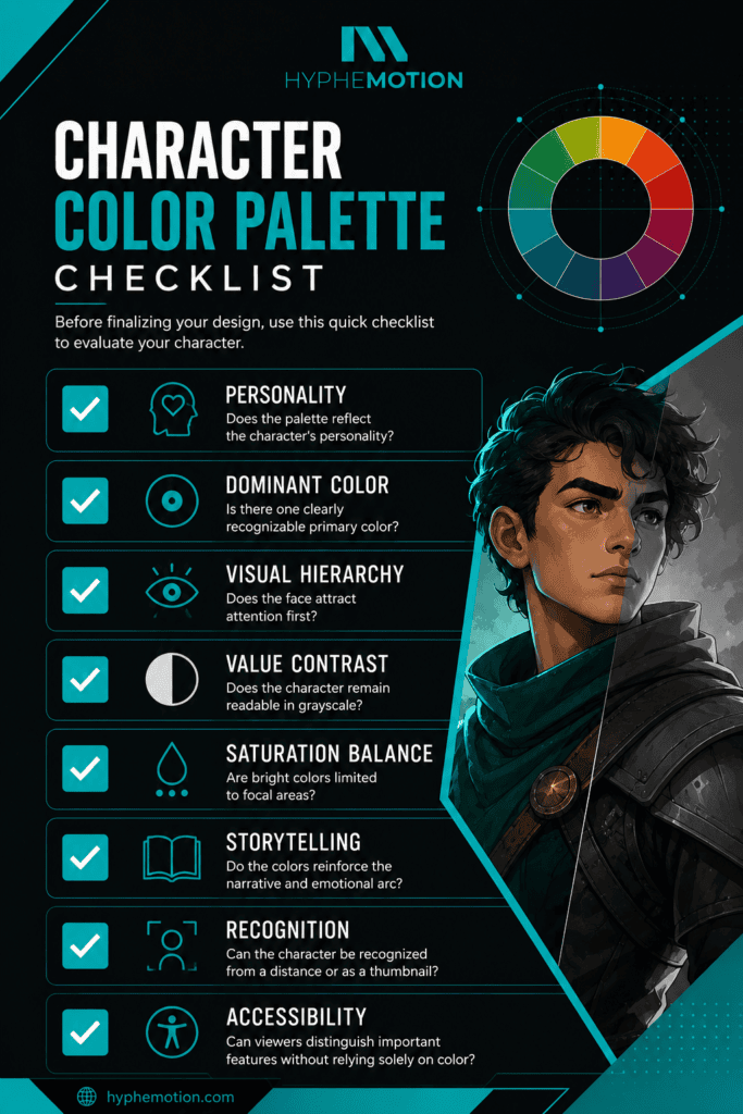
Before finalizing your design, use this quick checklist to evaluate your character.
| Checklist Item | Question to Ask |
| ✅ Personality | Does the color palette accurately reflect the character’s personality and role? |
| ✅ Dominant Color | Is there one clearly recognizable primary color that defines the character? |
| ✅ Visual Hierarchy | Does the viewer’s attention naturally go to the character’s face first? |
| ✅ Value Contrast | Does the character remain clear and recognizable when viewed in grayscale? |
| ✅ Saturation Balance | Are highly saturated colors used only for important focal points? |
| ✅ Storytelling | Do the colors reinforce the character’s narrative, emotions, and development? |
| ✅ Recognition | Can the character be easily recognized from a distance or at thumbnail size? |
| ✅ Accessibility | Can important features be distinguished without relying only on color? |
If you answer “yes” to each question, your palette is likely strong enough for production.
Frequently Asked Questions
What is color theory in character design?
Color theory in character design is the strategic use of hue, saturation, value, and color harmony to communicate personality, emotion, and story through a character’s visual appearance. A well-designed palette helps audiences understand who a character is before they speak.
Why is color important in character design?
Color influences first impressions, emotional responses, and character recognition. Combined with other elements of design, it strengthens visual storytelling and helps audiences instantly identify heroes, villains, or supporting characters.
What is the best color for a main character?
There isn’t one universal answer. The best color depends on your character’s personality and role in the story. Warm colors often suit energetic heroes, while cooler or muted tones work well for thoughtful, mysterious, or emotionally complex protagonists.
How many colors should a character palette have?
Most professional artists recommend using three to five primary colors. Following the 60–30–10 rule creates balance while preventing visual clutter.
What are the best three-color combinations for animation?
Some timeless combinations include:
- Blue, white, and gold
- Red, black, and silver
- Green, brown, and cream
- Purple, teal, and gray
- Navy, orange, and white
The best combination depends on your character’s personality, genre, and story rather than trends.
How do you fix a muddy character design?
Start by checking the design in grayscale. Muddy palettes usually result from poor value contrast rather than poor color selection. Increase the separation between light and dark areas and reduce unnecessary saturation.
Can villains wear bright or warm colors?
Absolutely. Many modern films and games deliberately give villains cheerful or vibrant palettes to create psychological contrast. When appearance conflicts with behavior, characters often become more memorable and unpredictable.
Color Is Your Character’s Silent Scriptwriter
Every unforgettable character begins with thoughtful design decisions, and few decisions are as influential as color.
When applied intentionally, color theory in character design does far more than make artwork visually appealing. It communicates personality, establishes emotional tone, strengthens relationships between characters, and supports the story long before a single line of dialogue is spoken.
The most memorable characters aren’t remembered because they use the brightest colors—they’re remembered because every color serves a purpose.
As you develop your next character, think beyond aesthetics. Consider how your palette reflects motivation, emotion, and narrative. Pair color with strong elements of design, purposeful storytelling techniques, and clear visual hierarchy to create characters that leave lasting impressions.
Whether you’re designing for animation, games, branding, or illustration, intentional color choices can transform an ordinary concept into an iconic character.
Bring Your Characters to Life with Hyphemotion
Great characters don’t just look good—they communicate, connect, and tell stories before they even move. At Hyphemotion, we combine color theory in character design, professional animation principles, and strategic visual storytelling to create memorable characters for brands, games, explainer videos, and digital experiences.
Ready to create characters that truly stand out? Contact Hyphemotion today and let’s bring your vision to life.